DaviesMurch
Project Brief
Through a recommendation this client came to us because they had never had a website or any online presence since starting the company back in 2014. The main reason for this was the fact they didn't really need to find new business online and because of that it had taken this long to come around thinking about having a company website.
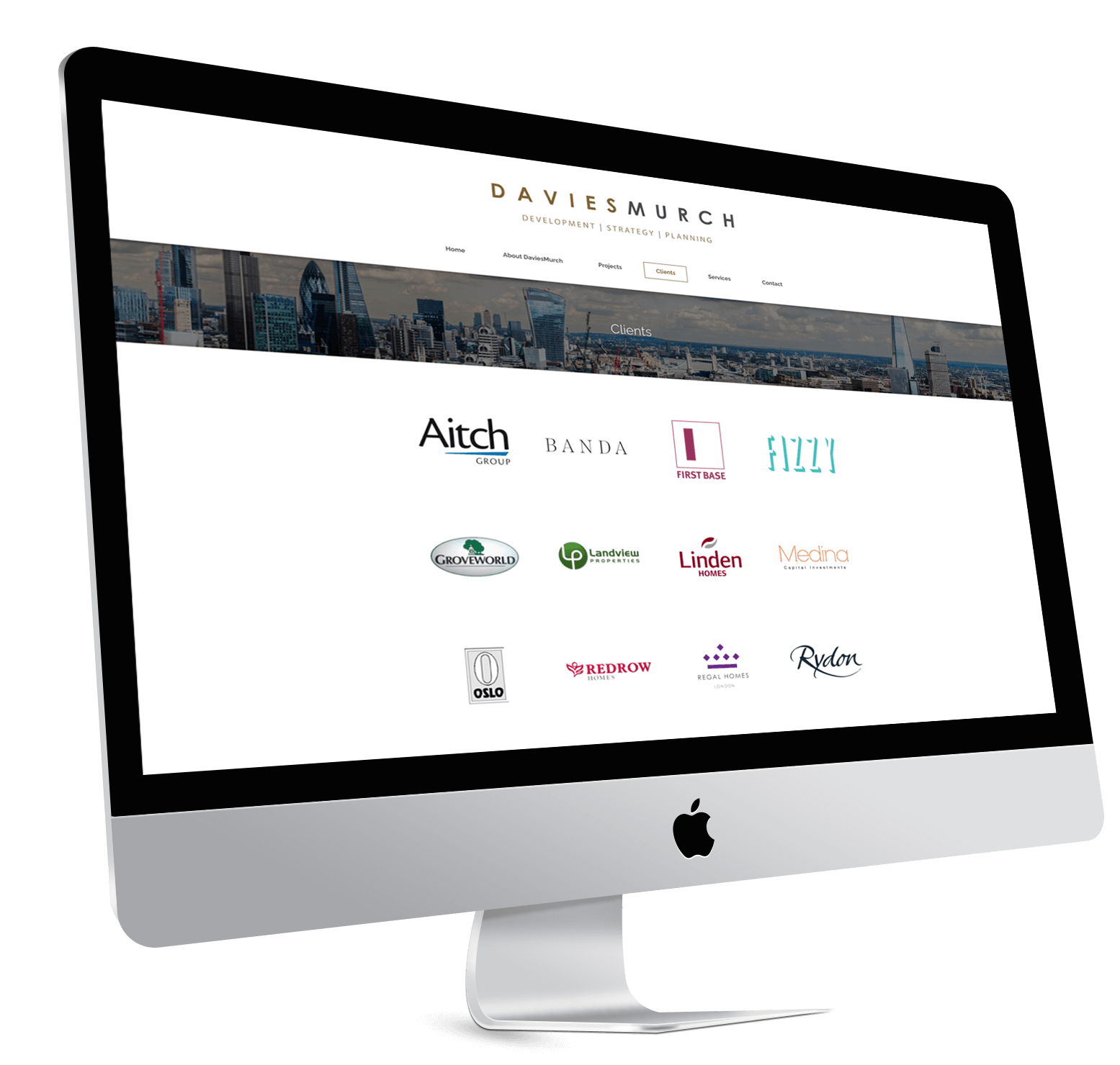
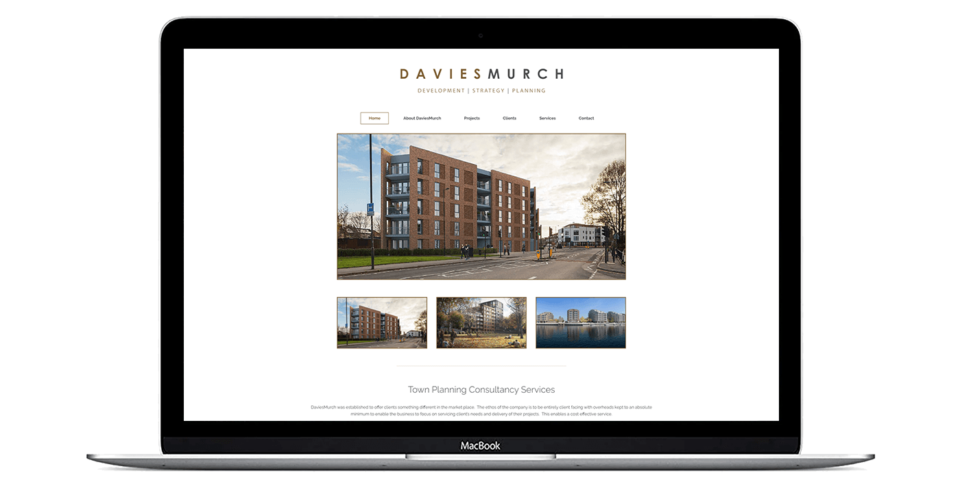
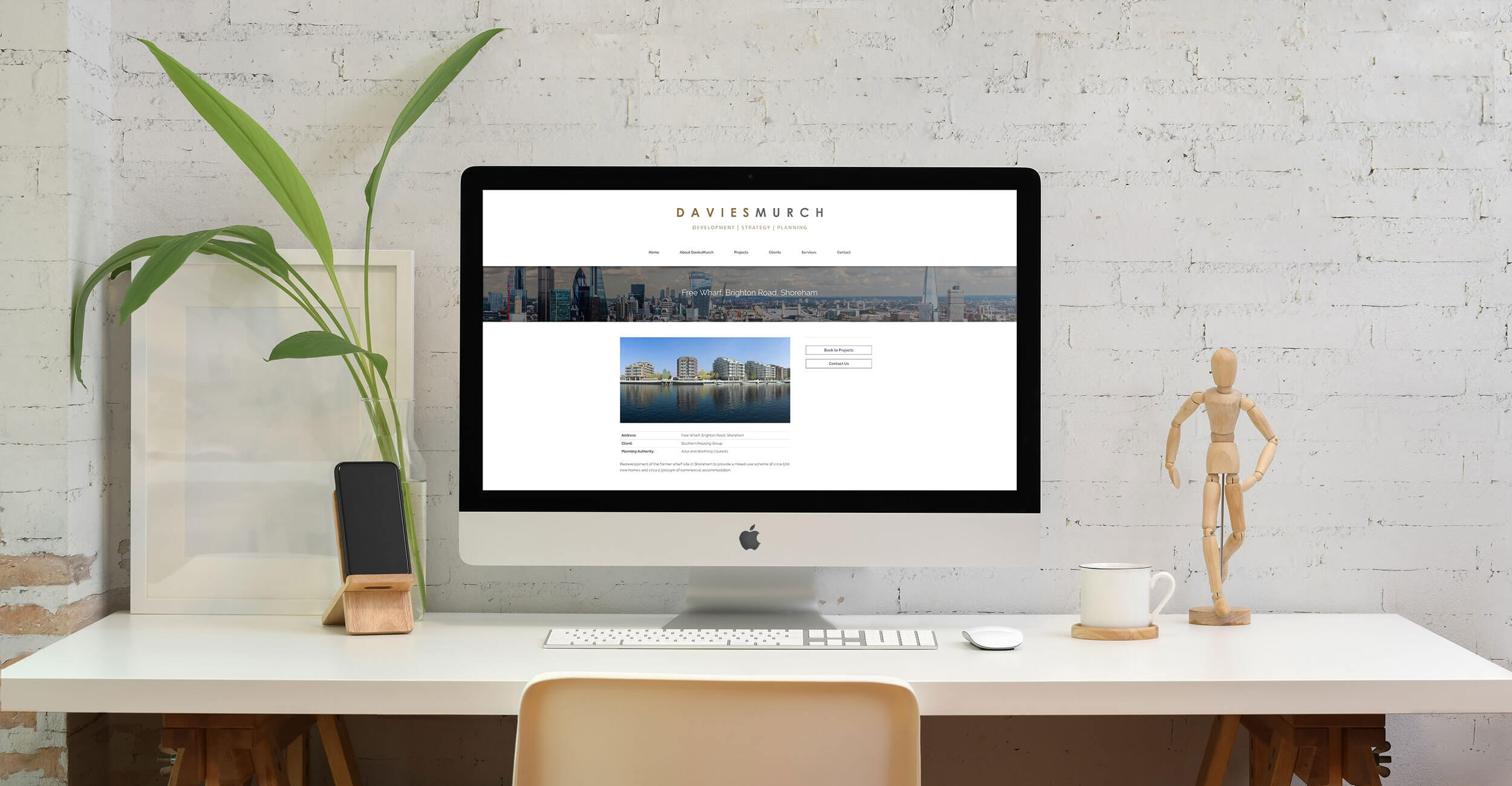
The website itself is fairly standard in the way it's a brochure website and is used to give some company background, showing off some of their recent projects and also the clients they have worked with too. All of the colour scheme and use of font is based around the logo that DaviesMurch has had from the start of the company when it first formed.
See Project Features
Project Features
Some of the key features which are part of this project build.
- Bespoke Design
- Wordpress CMS
- Responsive Website
- Projects
- Services


